
Fontish Type Scale Builder
Build responsive typography scales and export practical CSS, SCSS, or Tailwind values
Gallery
About Fontish Type Scale Builder
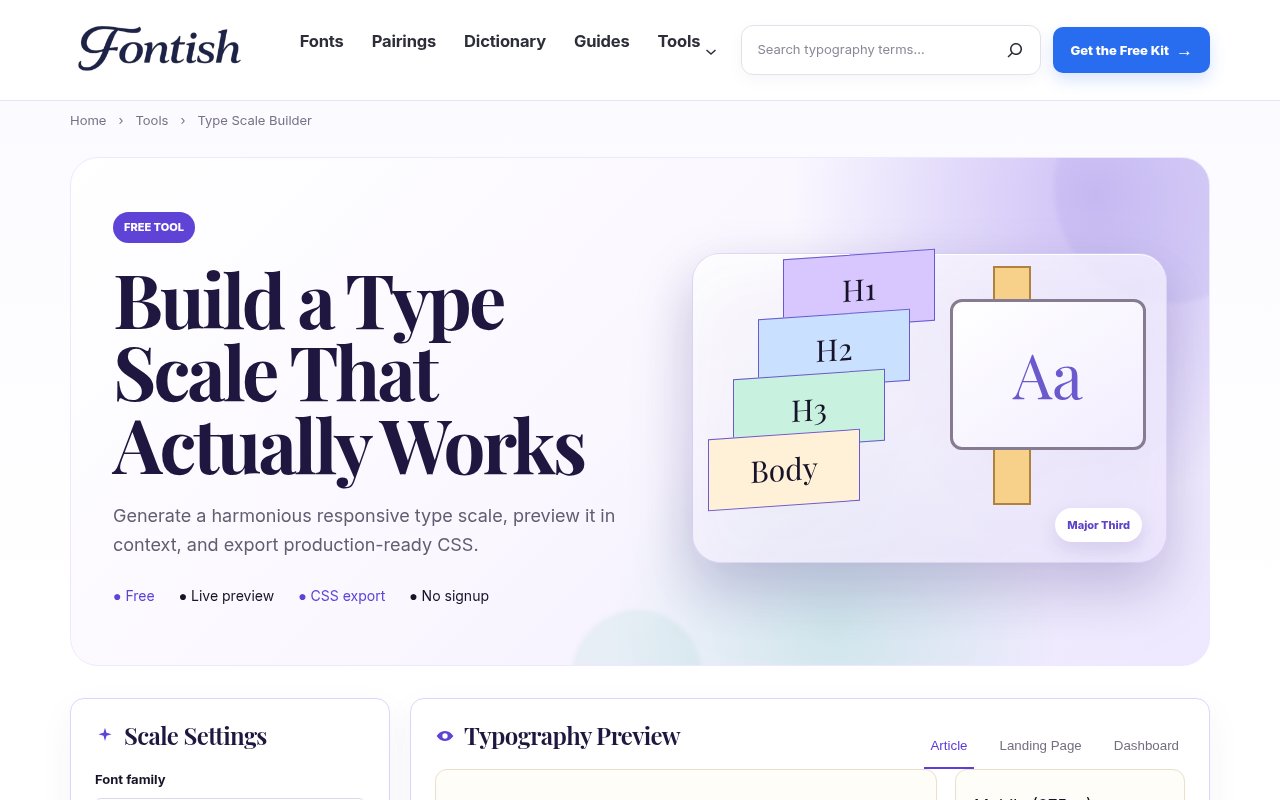
Fontish Type Scale Builder is a free browser tool for turning a body text size into a coherent set of display, heading, body, label, and supporting text styles. It addresses a common design problem that looks simple until a real page is involved. Picking a few font sizes by eye can produce weak hierarchy, inconsistent rhythm, and oversized mobile headings. The builder gives designers and developers a structured starting point, then lets them see the result in context before any values move into a codebase.
The setup is direct. A user chooses a font family, base size, scale ratio, line height, and heading weight, then sets desktop, tablet, and mobile breakpoints. Fontish calculates the related sizes and displays the generated scale in a table across those three viewport ranges. Preset ratios include familiar options such as Minor Third, Major Third, Perfect Fourth, and Golden Ratio. That makes it possible to compare a restrained interface scale with a more dramatic editorial one without calculating every step manually. The output covers more than large headings, so the system can account for the smaller roles that often get improvised late in a project.
The live preview is the most useful part of the workflow. Rather than showing isolated specimens only, the tool provides article, landing page, and dashboard views. Each view can be checked at desktop and mobile sizes, which makes awkward wraps and hierarchy problems easier to notice. A scale that looks polished in a marketing hero may feel wasteful in a dense dashboard, and a large ratio that works on a wide screen can overwhelm a phone. The builder encourages that comparison before export, while controls for weight and line height help the user evaluate rhythm alongside raw font size.
Once the scale feels right, Fontish can present the result as CSS, SCSS, or Tailwind output. Users can copy the code or download a CSS file, so the experiment can become an implementation without retyping every value. Responsive values are included rather than left as a separate exercise. The page also shows a compact accessibility check covering a body size of at least 16 pixels, comfortable line height, clear visual hierarchy, and the presence of responsive values. These checks are useful reminders, though they are not a substitute for testing contrast, zoom, language support, and real content in the finished interface.
The tool fits product designers, web designers, frontend developers, brand builders, and students who need a repeatable type hierarchy. It is especially practical at the beginning of a site or design system, when the team needs sensible tokens quickly but still wants room for visual judgment. It can also help with a redesign by exposing how a current collection of arbitrary sizes might be replaced with a smaller, related set. Because the previews use recognizable page patterns, less experienced users can see what a ratio means in practice instead of treating the number as an abstract typography rule. A useful working loop is to start from the intended body text, choose a modest ratio, and then move between the three previews while adjusting weight and line height. The generated table keeps desktop, tablet, and mobile values visible together, so the user can spot a breakpoint where one heading changes too sharply. Resetting and generating again is quick enough to compare several directions in one sitting. That makes the page useful during design discussion as well as implementation, since collaborators can evaluate the visible hierarchy before debating individual code values.
What separates the builder from a basic modular scale calculator is the combination of responsive settings, contextual previews, role-based output, and several export formats on one page. Fontish frames the generated values as a starting point rather than a universal answer. Different typefaces have different proportions, and the same numerical size can look very different across families. Real headlines, interface labels, translations, and narrow screens can still justify optical adjustments after export. The tool helps establish consistent logic, but it leaves the final design decision with the person using it.
Access is straightforward. The Type Scale Builder is free, requires no signup, and runs its calculations and previews instantly in the browser. There is no paid tier shown for the tool and no project workspace to learn before using it. That makes it easy to open for a quick scale, compare a few ratios, copy the chosen output, and move on. Teams that need shared libraries, version history, or full design token management will still need another system around it, but for building and testing a responsive typography foundation, its focused scope is a strength.
Key Features
- Responsive type scale generation
- Desktop and mobile previews
- Article, landing, dashboard contexts
- CSS, SCSS, Tailwind export
- Custom breakpoints and line height
- Built-in accessibility reminders
Pros & Cons
What we like
- Free to use without signup
- Shows scale choices in realistic layouts
- Exports responsive implementation code
- Keeps typography controls in one view
Room for improvement
- Focused on type scales rather than complete design tokens
- Accessibility checks are guidance, not a full audit
- Generated values still need real-content testing
- No shared project or version history
Frequently Asked Questions
What is Fontish Type Scale Builder?
Is Fontish Type Scale Builder free?
What can the builder export?
Does the generated scale guarantee accessible typography?
Best For
Featured in
Alternatives to Fontish Type Scale Builder

SoloDevStack
A solo developer blog built on head-to-head tool comparisons, 580+ posts deep.

Apatero Studio
Creator studio for AI image, video, audio, 3D, and avatars. Every model worth using, in one workspace.

Pixel Painters
Unlimited graphic design subscriptions built only for churches and ministries

Postdex
An exclusive marketplace for finished, human-made articles. Every piece sells once.
Reviews (0)
No reviews yet
Be the first to share your experience with Fontish Type Scale Builder
Sign in to write a reviewBadge builder
Add Fontish Type Scale Builder to your website
Choose a badge style and size, preview it here, then copy the generated HTML. Badge images are self-contained SVGs and do not require an external script.

<a href="https://toolindex.net/tools/type-scale-builder?ref=badge" target="_blank" rel="noopener">
  <img src="https://toolindex.net/badge/type-scale-builder/medium.svg" alt="Fontish Type Scale Builder - Listed on Tool Index" width="180" height="50" />
</a>How to use the badge
- 1. Pick the style, size, and theme that fit your layout.
- 2. Copy the generated HTML from the code block.
- 3. Paste it into your footer, homepage, or press page.
Standard badge available
The standard listing badge is available now. Score and circle badges are limited to tools currently ranked in the top 10 of a category.
Badge clicks return visitors to this profile with a referral tag so the source remains identifiable.
Related Tools

Confluence
Atlassian's long-running team wiki that anchors many enterprise knowledge stacks
SoloDevStack
A solo developer blog built on head-to-head tool comparisons, 580+ posts deep.
Apatero Studio
Creator studio for AI image, video, audio, 3D, and avatars. Every model worth using, in one workspace.

Logseq
An open-source outliner notes app where every bullet is a first-class block
Work on Fontish Type Scale Builder? Request listing access or correction