
Composables
Turn Jetpack Compose code into interactive demos for blogs, documentation, and websites
Gallery
About Composables
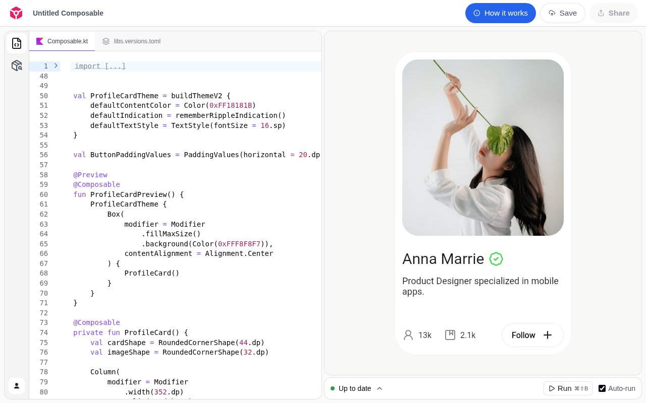
Composables is a browser-based workspace for creating interactive Jetpack Compose demos and embedding them on another website. It is aimed at Android developers, library authors, educators, and technical writers who have working Compose examples but don't want readers to see only a static code block or screenshot. A visitor can inspect the Kotlin source, view the rendered interface, and work with a demo in the context of a blog post, documentation page, or personal site.
The basic flow has three steps. A creator pastes or writes code for an annotated Composable, customizes how the final preview should appear, and saves it. Composables then provides a small script element that can be placed in the destination page. The published example loads from the Composables domain and includes settings for height, visual theme, and initial view. This makes the hosted demo reusable outside the editor without asking the site owner to build an Android rendering pipeline into a content system. Inside the workspace, code and preview are presented together. The editor exposes the Kotlin source file and a version catalog file named libs.versions.toml. A build can be run on demand, and an auto-run control is available for quicker feedback while the example changes. Build output can show warnings or expand to the full output, which helps an author catch a problem before copying the embed. The preview panel is tied to the saved Composable, so saving is the step that prepares it for viewing and sharing.
Package support is part of the environment rather than leaving every example limited to the standard library. The Packages panel shows dependencies already installed and lets the author search Maven Central for another Kotlin package. Added packages are reflected in the version catalog visible in the code area. That is useful for documentation examples that need a real library component, icon set, or supporting dependency. It also makes the dependency choice visible alongside the sample instead of hiding it in an unseen project.
The embed can open in Code, Split, or Preview view. Code emphasizes the implementation, Preview gives the rendered interface the available space, and Split keeps both in sight. Appearance can follow the viewer's system setting or be set to light or dark. These controls let an author match the purpose of the surrounding page. A tutorial may begin with code, a component catalog may begin with preview, and explanatory documentation can show both together.
A direct share link covers cases where an embed isn't needed. That gives an author a simple way to send a focused example for review before placing it on a permanent page. The saved preview becomes a self-contained reference for the code, dependency setup, build result, and visual output. Compared with attaching a screenshot and a separate source file, keeping those pieces together reduces ambiguity about which code produced the interface a reviewer is seeing. Composables is most useful when an example benefits from being experienced rather than merely read. A library maintainer can place a component demo next to API guidance. A developer writing about a layout can let readers compare its code and result in the same frame. A teacher can prepare a compact example that students can inspect without first cloning a repository and configuring a local project. The tool doesn't replace Android Studio for developing a complete application. It packages focused Compose examples for communication and discovery.
Saving and sharing require an account, with Google offered as the sign-in route on the public workspace. Once a Composable is saved, the creator can copy a direct link or the generated embed code. The script remains hosted by Composables, so the destination website depends on that hosted asset when a reader opens the page. That arrangement is simple for publishers because there is no preview server to operate, but teams with strict asset hosting or long-term archival requirements should account for the external dependency.
The service states that it is completely free to use and allows unlimited previews. No paid tier or usage price is shown on the public page. Its scope is purposefully narrow and technical, centered on Kotlin, Compose code, packages, builds, previews, links, and embeds. For the intended audience, that focus removes much of the setup between a useful Compose sample and an interactive piece of documentation. Authors who need a full application sandbox, private enterprise hosting, or extensive collaborative review would need to confirm those needs separately.
Key Features
- Interactive Compose previews
- Copyable website embed scripts
- Code split and preview views
- Maven Central package search
- Build output and warnings
- System light and dark themes
Pros & Cons
What we like
- Turns static examples into runnable visual demos
- Embed setup uses a small script snippet
- Supports packages from Maven Central
- Unlimited previews are free
Room for improvement
- Focused only on Jetpack Compose examples
- Saving and sharing require an account
- Embeds depend on an externally hosted script
- Not a replacement for full Android development
Frequently Asked Questions
What is Composables?
Is Composables free?
What can an embedded demo show?
Can a demo use external Kotlin packages?
Best For
Featured in
Alternatives to Composables

Kevin Gabeci
Solo developer building web apps, cozy browser games, and AI creator toolkits.

SoloDevStack
A solo developer blog built on head-to-head tool comparisons, 580+ posts deep.

Codedex
A gamified, story-driven platform that teaches Python, web dev, and more like an RPG quest

Vibe Built
Building real apps with agentic AI. What worked, what broke, what shipped.
Reviews (0)
Badge builder
Add Composables to your website
Choose a badge style and size, preview it here, then copy the generated HTML. Badge images are self-contained SVGs and do not require an external script.

<a href="https://toolindex.net/tools/composables?ref=badge" target="_blank" rel="noopener">
  <img src="https://toolindex.net/badge/composables/medium.svg" alt="Composables - Listed on Tool Index" width="180" height="50" />
</a>How to use the badge
- 1. Pick the style, size, and theme that fit your layout.
- 2. Copy the generated HTML from the code block.
- 3. Paste it into your footer, homepage, or press page.
Standard badge available
The standard listing badge is available now. Score and circle badges are limited to tools currently ranked in the top 10 of a category.
Badge clicks return visitors to this profile with a referral tag so the source remains identifiable.
Related Tools
Kevin Gabeci
Solo developer building web apps, cozy browser games, and AI creator toolkits.

Coolify
Self-hostable, open source alternative to Heroku and Netlify

Warp
The modern terminal reimagined with AI and collaboration

Bolt.new
Prompt-to-deployed full-stack app inside the browser
Work on Composables? Request listing access or correction