Heroicons
Free, MIT-licensed SVG icon set crafted by the Tailwind Labs team, with outline, solid, mini, and micro variants.
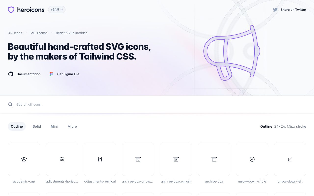
Gallery
About Heroicons
Heroicons is the icon set you have probably already shipped without knowing it. It is a free, MIT-licensed library of SVG icons designed by the Tailwind Labs team. Heroicons ships in three styles (outline, solid, and mini) and integrates cleanly with React, Vue, and plain HTML.
If you have used a modern Tailwind app in the last few years, Heroicons is in there. The aesthetic is clean, balanced, and intentionally neutral so it can sit next to a brand without competing. That neutrality is the entire point.
The library is not the biggest in the world. It is the most opinionated about consistency and that is why it punches above its weight.
What Heroicons gives you
Heroicons ships roughly 300 icons across three render styles. Outline icons are 24x24 with stroke-based shapes. Solid icons are 24x24 filled versions. Mini icons are 20x20 solids tuned for small UI like buttons and inline labels. Recent versions added a 16x16 micro set.
Distribution is straightforward. NPM packages exist for plain SVG, React, and Vue components. The website lets you copy SVG markup or JSX directly. Tailwind CSS is the implicit design partner; the spacing and weights match the Tailwind defaults out of the box.
Every icon is hand-drawn for the size it lives at. The 20px mini icons are not just shrunk versions of the 24px outlines. That detail is what makes them not look weird in tight UI.
Who Heroicons is for
Web developers using Tailwind CSS pick Heroicons by default. Designers in Figma use the official Figma library to design and hand off. Product teams ship Heroicons because the visual consistency saves a hundred small decisions.
It is also a fine choice outside the Tailwind orbit. The icons work in any CSS framework or none at all. Plain SVG copy-paste is a supported workflow.
Pricing
Free. MIT licensed. Use them in commercial projects, open-source projects, weekend hacks, and enterprise apps. The license terms are about as permissive as licenses get.
The Tailwind Labs team funds Heroicons through their commercial products like Tailwind UI. The icons themselves are not a revenue product, which is why they stay free.
Features worth highlighting
The React and Vue packages export each icon as a component. You import what you need, tree-shaking removes the rest, and your bundle stays small. The components accept className and other props that pass through to the SVG.
The CDN distribution means you do not have to install anything for a quick prototype. Copy a single SVG snippet from the website, paste it into your HTML, and you are done.
The Figma library mirrors the code library. Designers and developers can stay aligned with zero translation overhead, which is the unspoken superpower of any design system.
Updates ship through GitHub with a clear changelog. New icons get added; existing ones occasionally get a small redraw. Migration is rarely a problem because icon names stay stable.
Tradeoffs
Heroicons is intentionally small. If you need 5,000 icons covering every niche use case, this is not your library. Look at Lucide, Phosphor, or commercial sets like Streamline.
The visual style is a single style. You cannot mix in icons that match the same line weight from a different library without it looking off. Pick one library and commit.
The icons are SVG-based. If you are shipping for a context where SVG is not ideal (some print or older systems), you will need to rasterize.
Heroicons is the right default if you are shipping anything in the modern web stack. The wrong choice in this category is "I will draw my own."
Heroicons vs alternatives
Versus Lucide, Heroicons has fewer icons and a tighter visual bias. Lucide is bigger and more flexible, with more options across line weight and density. Pick Heroicons for Tailwind orthodoxy; pick Lucide for variety.
Versus Phosphor, Heroicons is more conservative. Phosphor offers six weights, which is great if your design needs variety; Heroicons offers three sizes, which is great if you want one consistent look.
Versus Material Symbols and Material Icons, Heroicons is more web-native and less Google-flavored. Material Symbols ship more icons; Heroicons ship a tighter aesthetic.
Versus paid sets like Streamline or Iconscout, Heroicons is free and more limited. The paid sets give you breadth and licensing certainty for huge enterprise use.
See best icon libraries, Font Awesome alternatives, and the Heroicons vs Lucide breakdown.
Common questions
Is Heroicons free for commercial use? Yes, MIT licensed. Does Heroicons work without Tailwind? Yes, the icons are plain SVG. Does it have a Figma kit? Yes, official, free. Can I request new icons? Yes, via GitHub issues, though approval is selective.
Bottom line
Heroicons is the safe, opinionated default for modern web UI. The library is small enough to learn in a sitting and consistent enough to hide a hundred design decisions. If you need an enormous icon catalog or many style weights, look at Lucide or a paid set, but most projects benefit from Heroicons's tight scope.
For any team building product UI in 2026, Heroicons remains a top three pick. See tools for designers and the Heroicons profile for installation and license details.
Working with Heroicons in code
React: install @heroicons/react, import the icon as a component, use it like any other JSX element. The component accepts className for sizing and color, plus standard SVG props.
Vue: same pattern with @heroicons/vue. Component usage with props and v-bind for dynamic icons.
Plain HTML: copy the SVG markup from the website, paste it into your template, style with CSS. No build step required.
Tailwind classes work directly on Heroicon components. Common pattern: w-5 h-5 text-gray-500 for a small subdued icon, w-6 h-6 text-blue-600 for a primary action icon.
Choosing the right size and style
Outline (24px) is for primary navigation, list items, and standalone meaningful icons. The line weight is right for that scale.
Solid (24px) is for active states, indicators, and high-emphasis UI. The filled shape reads stronger than outline.
Mini (20px) is for buttons, inline labels, form fields, and tight UI where 24px feels too big. Solid by default at this size.
Micro (16px) is the newest addition for very tight UI like menu items and inline metadata. Use sparingly; smaller than this and accessibility starts to suffer.
Accessibility and Heroicons
Decorative icons should have aria-hidden="true" so screen readers ignore them. Most icons next to text labels are decorative.
Standalone icons (icon-only buttons) need an accessible label. Use aria-label on the button or visually-hidden text inside.
Color contrast still applies. A subtle gray icon on a light background may fail WCAG; check it.
When to leave Heroicons
If you need icons Heroicons does not have, mixing in a second library tends to look off. Better to switch fully to Lucide or Phosphor for breadth.
If your design language wants thinner or thicker line weights, Heroicons is fixed. Phosphor's six weights are the answer there.
If you need brand or logo icons, look at Simple Icons rather than Heroicons. Heroicons is interface icons; Simple Icons is brand marks.
Heroicons changelog and roadmap
Version 2 (current major) introduced the redesigned 24px outlines and 20px mini set. The previous v1 set still exists; some projects pin to v1 for compatibility.
Releases ship through GitHub with a changelog. Major versions are rare; minor versions add icons and occasional refinements.
The roadmap is informal. New icons get added based on community requests with selective approval. The library stays small on purpose.
Heroicons in design systems
Most design systems standardize on a single icon library. Heroicons fits in design systems built on Tailwind; the visual language matches.
For design systems with custom brand language, a custom icon library may be better. Heroicons is a reasonable starting point that you can extend with brand-specific icons drawn in the same style.
The Figma library is the canonical handoff format. Designers reference icon names; developers import the same names. Zero translation overhead.
Common questions, expanded
Can I modify Heroicons? Yes, MIT permits modification. Many projects tweak stroke widths or fills.
Can I use Heroicons in a paid product? Yes, MIT permits commercial use. No attribution required.
Why is the library small? The team prioritizes consistency and quality over breadth. The 300 icons cover the common cases for product UI.
Is there a roadmap for animation? Not officially. SVG animation is a separate concern; some projects animate Heroicons with CSS or libraries.
Heroicons in production at scale
Bundle size: importing only the icons you use, with tree-shaking, keeps the bundle small. Importing the whole library is a common mistake; do not.
SVG sprites are an alternative pattern; reference icons by ID from a single sprite file. Useful for static sites; less common in component-driven apps.
Lazy loading of icons matters less than people think. The total weight is small even with many icons.
Heroicons community contributions
The GitHub repo accepts pull requests for new icons; the bar is high. Most requested icons get added eventually.
Stylistic consistency is the gating factor. New icons must match the existing visual language.
The community has built complementary tools: Heroicons search engines, framework integrations beyond React and Vue, design system templates.
Tutorial / Demo
Key Features
- Four size and weight variants per icon
- Hand-tuned proportions per pixel grid
- React and Vue components plus raw SVG
- MIT license with commercial-use rights
- Designed to pair with Tailwind CSS conventions
- Curated catalog kept intentionally focused
Pros & Cons
What we like
- Crisp rendering at small sizes thanks to per-grid tuning
- Reliable maintenance from the Tailwind Labs team
- MIT license removes any commercial-use friction
Room for improvement
- Catalog is narrower than larger competing icon libraries
- Visual style closely tied to Tailwind aesthetic
Frequently Asked Questions
Are Heroicons really free for commercial use?
What's the difference between outline, solid, mini, and micro?
Heroicons vs Lucide, which has more icons?
How do I use Heroicons in React?
Can I customize the colors and stroke?
Best For
Featured in
Tags
Alternatives to Heroicons
View all
Pixelmator Pro
Mac-native raster and vector image editor with machine-learning enhancements and a one-time purchase price.
ProtoPie
High-fidelity prototyping tool that simulates sensor input, IoT triggers, and complex interactions without writing code.
Turborepo
High-performance build system for JavaScript and TypeScript monorepos

Excalidraw
Virtual whiteboard for sketching hand-drawn-like diagrams
Reviews (2)
Solid daily driver
The pitch for Heroicons sounded too good to be true. Mostly true. Real selling point: MIT license removes any commercial-use friction. Their take on curated catalog kept intentionally focused is solid. Main use case: building UIs alongside Tailwind CSS or Headless UI. Still recommending it to people in similar setups.
Onboarded the team in a day
First impression of Heroicons was 'huh, this is actually thought through.' Honestly impressed by how reliable maintenance from the Tailwind Labs team. Worth the price for what I get out of it.
Related Tools
SoloDevStack
Tool guides and stack advice for solo developers
Apatero Studio
Creator studio for AI image, video, audio, 3D, and avatars. Every model worth using, in one workspace.

VS Code
The code editor that adapts to any workflow

Tailwind CSS
Rapidly build custom designs without leaving your HTML