Kobra
Polished React components with motion, sound, accessibility, and agent tooling
Gallery
About Kobra
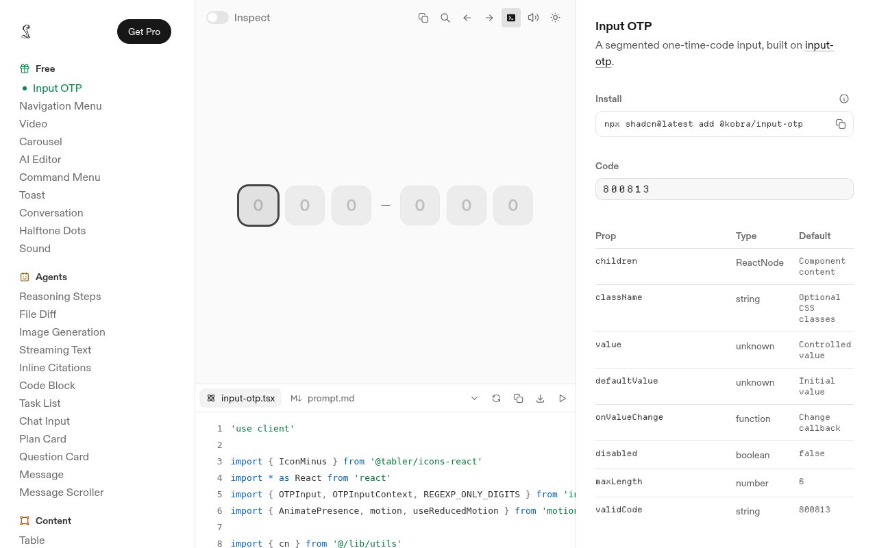
Kobra is a library of polished React interface components for developers and designers who like the copy-and-own workflow of shadcn but want more of the visual finish handled up front. Instead of installing an opaque package and accepting its design decisions, customers receive the source for the components they use. The catalog covers ordinary product interface needs as well as more specialized surfaces for AI applications. Its pitch is practical for small teams that can build a functional interface quickly but do not want every new product to inherit the same default component look.
The gallery contains more than 70 components across navigation, forms, feedback, content, layout, overlays, and agent experiences. Familiar building blocks include buttons, dialogs, sidebars, calendars, tables, charts, carousels, and one-time password inputs. The AI-oriented collection adds chat inputs, messages, reasoning steps, file diffs, streaming text, inline citations, plan cards, task lists, and image generation surfaces. Each component page provides a live preview, the implementation source, installation guidance, prop details, and notes about composition, so a developer can inspect what will enter the project before adopting it.
Kobra uses a shadcn-compatible installation flow and describes its API as a drop-in fit for shadcn projects. Components are built with Tailwind CSS and Base UI primitives, while interactive examples use libraries such as Motion where needed. The source lives in the customer's application after installation, which makes local changes possible without waiting for a package maintainer to expose another prop. The site also emphasizes responsive behavior, light and dark themes, right-to-left support, keyboard operation, contrast, and screen reader testing against WCAG 2.1 AA. Those claims apply to the paid collection described on the pricing page.
Visual behavior is where Kobra tries to move beyond a generic starter kit. Motion is tuned for individual controls instead of applied as one effect everywhere. The library includes synthesized interface sound from a shared layer, along with hand-tuned dark mode and design token exports. A Figma kit uses the same tokens as the code, which gives design and engineering a common reference rather than two loosely related assets. Teams can still restyle the source to match their own product because the delivered code and CSS remain accessible.
Kobra also packages its system for AI-assisted development. Paid access includes an MCP server that lets compatible agents read the component system, plus AI skills for motion, sound, and design system migration. Every component comes with a handoff prompt intended to help move it into another context. This is useful for teams that ask coding agents to assemble product screens and want those agents to work from the actual library instead of guessing component names or generating near-duplicates. It does require a React and Tailwind-oriented stack, so it is not a general design asset library for every frontend framework.
The copy-and-own model changes what adoption looks like. Developers install a component through the shadcn command line flow, then keep the resulting file and its required CSS inside the application. Kobra's examples expose the full implementation, and the component pages document props and the smaller named parts that can be arranged together. Many controls forward normal element or primitive behavior and include data attributes that teams can style against. More elaborate pieces depend on supporting packages such as Motion, Embla Carousel, or input-specific libraries, so each page is worth checking before installation. The advantage is clear ownership of the final code. The tradeoff is that upgrades and local changes become part of the application's maintenance work.
The free option includes ten components, the Figma kit, light and dark themes, interface sound design, and community support. The gallery remains free to browse. It is limited to personal use. The Individual license is a one-time purchase for one designer or developer and unlocks the full component set, commercial projects, lifetime updates, agent tooling, and direct support. Team licensing covers multiple seats and adds faster support, purchase orders, custom invoicing, and priority requests. There is no recurring renewal in the listed license model, but a commercial team should expect to buy the appropriate paid license rather than treating the free gallery as a production kit.
Key Features
- Seventy plus React components
- Shadcn compatible installation
- Motion and interface sound
- Accessible responsive components
- Matching Figma design kit
- MCP server for agents
Pros & Cons
What we like
- Delivers editable source instead of a closed package
- Covers standard interfaces and AI product surfaces
- Pairs component code with matching Figma tokens
- Uses a one-time commercial license
Room for improvement
- Free components are limited to personal use
- Best suited to React and Tailwind projects
- Full library requires a sizable upfront purchase
- Some components add extra frontend dependencies
Frequently Asked Questions
What is Kobra?
Can Kobra work with an existing shadcn project?
Is Kobra free?
What comes with a paid Kobra license?
Best For
Featured in
Alternatives to Kobra

Kevin Gabeci
Solo developer building web apps, cozy browser games, and AI creator toolkits.
SoloDevStack
A solo developer blog built on head-to-head tool comparisons, 580+ posts deep.
Codedex
A gamified, story-driven platform that teaches Python, web dev, and more like an RPG quest
Vibe Built
Building real apps with agentic AI. What worked, what broke, what shipped.
Reviews (0)
Badge builder
Add Kobra to your website
Choose a badge style and size, preview it here, then copy the generated HTML. Badge images are self-contained SVGs and do not require an external script.

<a href="https://toolindex.net/tools/kobra?ref=badge" target="_blank" rel="noopener">
  <img src="https://toolindex.net/badge/kobra/medium.svg" alt="Kobra - Listed on Tool Index" width="180" height="50" />
</a>How to use the badge
- 1. Pick the style, size, and theme that fit your layout.
- 2. Copy the generated HTML from the code block.
- 3. Paste it into your footer, homepage, or press page.
Standard badge available
The standard listing badge is available now. Score and circle badges are limited to tools currently ranked in the top 10 of a category.
Badge clicks return visitors to this profile with a referral tag so the source remains identifiable.
Related Tools
Kevin Gabeci
Solo developer building web apps, cozy browser games, and AI creator toolkits.
Coolify
Self-hostable, open source alternative to Heroku and Netlify

Warp
The modern terminal reimagined with AI and collaboration

Bolt.new
Prompt-to-deployed full-stack app inside the browser
Work on Kobra? Request listing access or correction