Nikala UI
Component system for SolidJS built on Tailwind CSS v4 with theme customization
Gallery
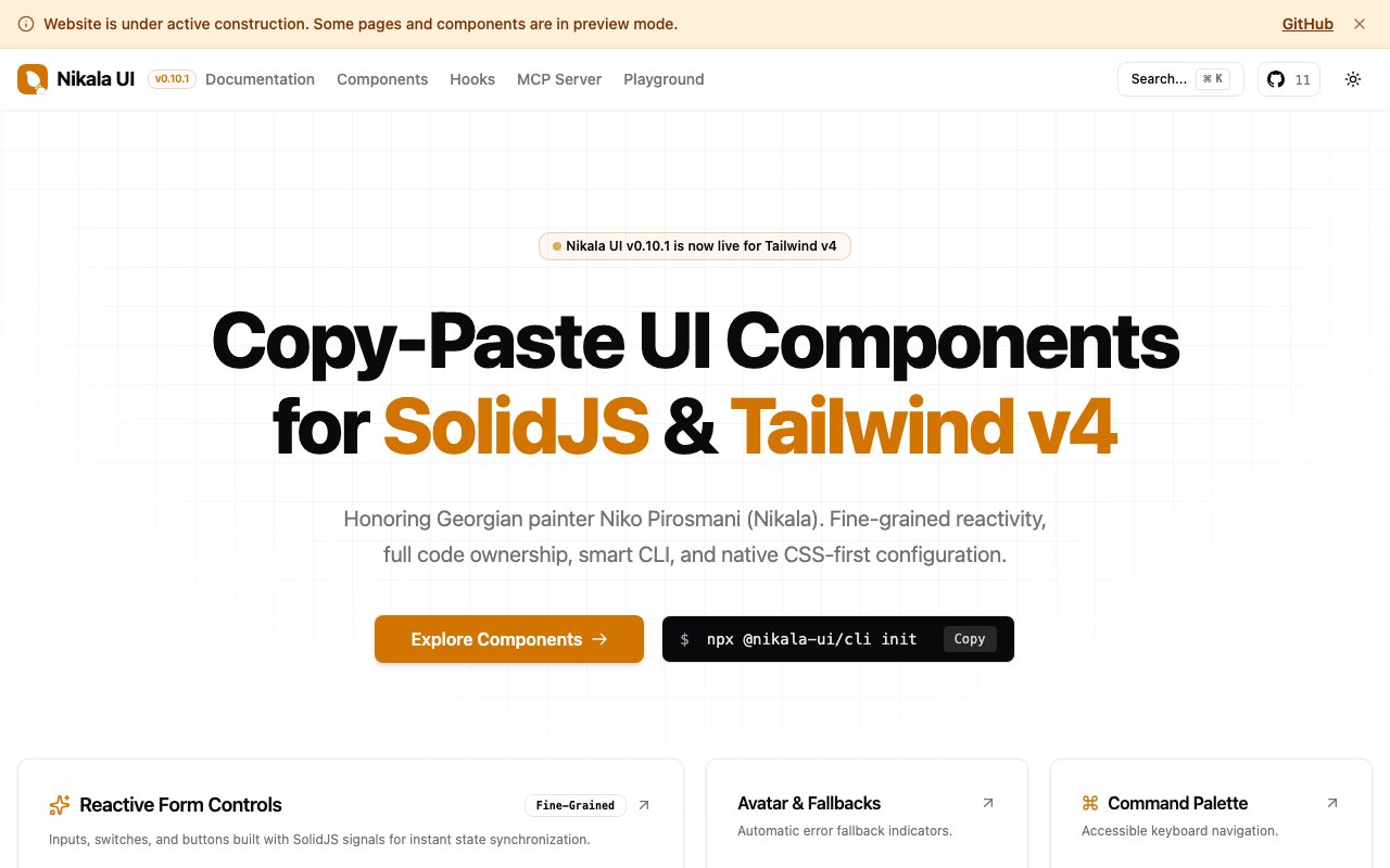
About Nikala UI
Nikala UI is a component system and reactive primitives suite built natively for SolidJS and Tailwind CSS v4. The approach is copy-paste rather than npm-install, meaning you grab the component code you need and drop it directly into your project rather than importing from a heavy dependency. This gives you full ownership of the components and makes customization straightforward because you're editing your own code rather than overriding a library's defaults. The project is named in honor of Niko Pirosmani, the famous Georgian painter, which gives you a sense of the aesthetic sensibility behind it.
SolidJS occupies an interesting spot in the frontend ecosystem. It offers fine-grained reactivity that's conceptually similar to React's hooks but with a compilation model that avoids the virtual DOM overhead. The result is faster runtime performance, but the catch is that the component ecosystem is much smaller than what React or Vue developers have access to. Most UI libraries target React first and maybe offer a SolidJS port as an afterthought, if at all. Nikala UI takes the opposite approach, building for SolidJS as the primary target so that components actually leverage the framework's reactivity model instead of working around it.
The theming system is central to how the library works. Developers can switch between light, dark, and system preference modes, and the selection persists automatically in local storage so users keep their preferences across sessions. Accent colors include amber, violet, sky, emerald, rose, and zinc, each with different values calibrated for light and dark modes. Border radius and other styling variables are configurable through the theme system, which means you can drop components into a project and have them match your brand without hunting through stylesheets to override defaults. The whole setup runs on CSS custom properties, making the theming extensible beyond the built-in options.
Building on Tailwind CSS v4 rather than v3 is a deliberate choice. Tailwind v4 introduced native CSS layers, a new architecture for how utility classes are generated, and performance improvements that matter at scale. For teams already using Tailwind in their stack, adopting Nikala UI doesn't require learning a new styling paradigm. The components use the same utility classes you're already familiar with, wrapped in a component API that fits SolidJS patterns. If you've built Tailwind projects before, the code inside these components will read naturally rather than feeling like a foreign abstraction.
The library includes both styled components for common UI patterns and reactive primitives that handle state and interaction logic. This dual focus means you're getting more than just visual elements. The primitives handle the reactive behavior that makes components work correctly in a SolidJS context, which is where generic React component ports often fall short. Because SolidJS signals and React hooks behave differently at the fundamental level, ports that don't account for that difference end up fighting the framework rather than using it.
Target users are frontend developers building applications with SolidJS who want ready-made interface elements instead of creating everything from scratch. If you're prototyping an app, building an internal tool, or shipping a product and want consistent UI components that handle states, accessibility, and theming, Nikala UI is designed to accelerate that process. It's particularly useful for smaller teams and solo developers who don't have the time to build and maintain a complete design system but still want their product to look polished and behave correctly. The copy-paste model also suits developers who dislike depending on third-party component libraries that can change or introduce breaking updates.
Pricing appears to be free. The library is available for use without a visible paid tier or license requirement. Documentation covers theme configuration and component usage, though the site is still being built out and some pages may be incomplete. Compatibility with SolidStart, the official SolidJS meta-framework, is supported, so you can use these components in both standalone SolidJS apps and SolidStart projects with routing and server rendering. Developers comfortable with SolidJS and Tailwind should be able to adopt it quickly, but those new to either framework will want to learn the fundamentals first because the documentation assumes familiarity with both. The naming after Pirosmani hints at an aesthetic sensibility that values artistry alongside functionality.
Key Features
- Pre-built components for SolidJS applications
- Tailwind CSS v4 integration
- Dark and light theme modes
- Customizable accent color system
- Local storage theme persistence
- SolidStart compatibility
Pros & Cons
What we like
- Built natively for SolidJS rather than ported from React
- Uses Tailwind CSS v4 for modern styling capabilities
- Theme preferences persist across sessions automatically
- Multiple accent color options included out of the box
Room for improvement
- Documentation is still being developed
- Smaller community than React component libraries
- Requires familiarity with both SolidJS and Tailwind
- Newer library with less production battle testing
Frequently Asked Questions
What is Nikala UI?
Is Nikala UI free?
Who is Nikala UI for?
Does Nikala UI support dark mode?
Best For
Featured in
Alternatives to Nikala UI

Kevin Gabeci
Solo developer building web apps, cozy browser games, and AI creator toolkits.
SoloDevStack
A solo developer blog built on head-to-head tool comparisons, 580+ posts deep.

Codedex
A gamified, story-driven platform that teaches Python, web dev, and more like an RPG quest

Vibe Built
Building real apps with agentic AI. What worked, what broke, what shipped.
Reviews (0)
Badge builder
Add Nikala UI to your website
Choose a badge style and size, preview it here, then copy the generated HTML. Badge images are self-contained SVGs and do not require an external script.

<a href="https://toolindex.net/tools/nikala-ui?ref=badge" target="_blank" rel="noopener">
  <img src="https://toolindex.net/badge/nikala-ui/medium.svg" alt="Nikala UI - Listed on Tool Index" width="180" height="50" />
</a>How to use the badge
- 1. Pick the style, size, and theme that fit your layout.
- 2. Copy the generated HTML from the code block.
- 3. Paste it into your footer, homepage, or press page.
Standard badge available
The standard listing badge is available now. Score and circle badges are limited to tools currently ranked in the top 10 of a category.
Badge clicks return visitors to this profile with a referral tag so the source remains identifiable.
Related Tools
Kevin Gabeci
Solo developer building web apps, cozy browser games, and AI creator toolkits.
Coolify
Self-hostable, open source alternative to Heroku and Netlify

Warp
The modern terminal reimagined with AI and collaboration

Bolt.new
Prompt-to-deployed full-stack app inside the browser
Work on Nikala UI? Request listing access or correction