
Storybook
Open-source workshop for building UI components in isolation. Preview, document, and test them outside the app.
Gallery
About Storybook
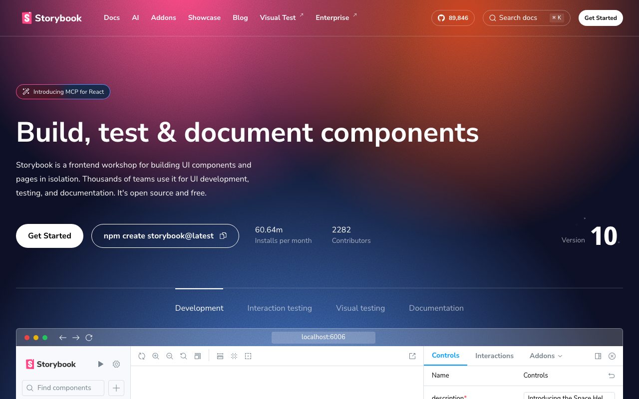
Storybook is the open source workshop for UI components. Frontend developers use it to build, test, and document components in isolation, away from the noise of a full app. Storybook supports React, Vue, Angular, Svelte, Web Components, and most other frontend frameworks.
The pitch is that components are easier to build when you can see them by themselves. Storybook gives every component a sandbox, with controls to flip props, viewports to test responsive behavior, and a docs page that ships with the component.
What Storybook actually does
Storybook runs alongside your app and renders each component in isolation. You write stories, which are little examples of a component with specific props. Each story shows up in the Storybook UI with controls, viewports, and an interactive sandbox.
Beyond rendering, Storybook supports interaction tests, visual regression tests through Chromatic, accessibility audits, and full design system documentation. It plugs into the build pipeline as a CI gate for UI quality.
Who Storybook is built for
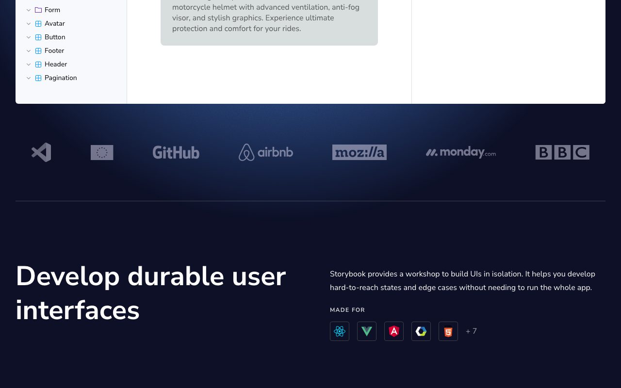
Storybook is built for frontend developers, design system teams, and product teams that ship a lot of UI. Companies like Airbnb, Shopify, BBC, and Stripe use it as their component workshop and design system surface.
It's not really for backend-heavy teams or projects with very few UI components. The setup overhead is real, and the value scales with the size of your component library.
Storybook pricing
Storybook itself is free and open source. The companion product, Chromatic, is paid. Chromatic adds visual regression testing, review workflows, and Storybook hosting on a CDN.
For most teams, the free Storybook setup is enough until they want serious visual review. Browse Storybook alternatives if you're benchmarking.
Features that define Storybook
Stories are simple JavaScript files that describe a component in different states. The format is a tiny standard called Component Story Format. Stories can also serve as the foundation for tests.
Controls let designers and PMs tweak component props in the UI without touching code. Viewports test responsive behavior. Backgrounds and theming let you preview components in any context.
Addons extend Storybook with accessibility checks, internationalization, theming, performance profiling, and more. The addon ecosystem is the heart of the product, with hundreds of community-built tools.
Storybook is the hidden infrastructure of most serious design systems. If you've ever opened the Shopify Polaris docs, you've used a Storybook fork.
Tradeoffs and rough edges
Setup takes effort, especially in non-trivial codebases with custom build configs. Recent versions have improved this, but it's still a real time investment.
Build performance on huge component libraries can lag without tuning. Storybook 8 and the newer Vite-based runtime have made this much better.
Storybook vs alternatives
The closest competitors are Ladle, Histoire, and homegrown component galleries. Ladle is a fast, minimal alternative built on Vite. Histoire is the Vue-centric option. Many teams roll their own pages, which usually ends in regret.
Storybook's edge is the ecosystem, the addon library, and the framework coverage. See Storybook vs Ladle and the best design system tools.
Common questions about Storybook
Is Storybook only for React? No, it supports Vue, Svelte, Angular, Web Components, and more.
Does Storybook help with testing? Yes, stories are reusable for unit and visual tests.
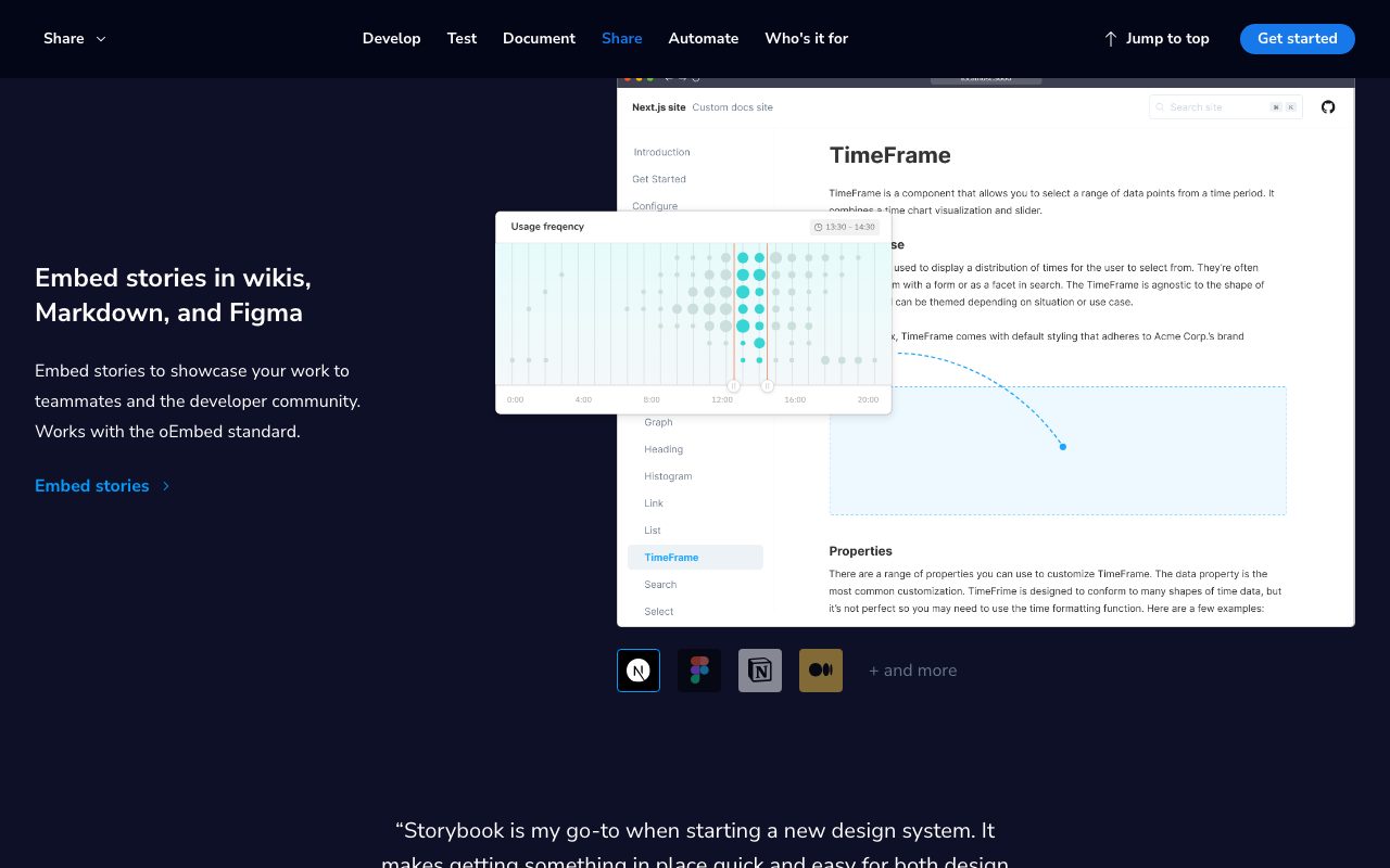
Can Storybook host docs publicly? Yes, deploy as a static site or use Chromatic for hosting.
Bottom line on Storybook
Storybook is the de facto component workshop for serious frontend teams. It's worth the setup time if your codebase has a real UI surface. Browse tools for developers for the rest of the stack.
If you ship a design system or a component library, Storybook isn't optional, it's expected.
Storybook for design system teams
Design system teams ship components through Storybook. Each component lives with its stories, tests, and docs in one place. The Storybook deployment becomes the canonical reference for designers and engineers.
Visual regression through Chromatic catches accidental UI changes before they ship. Each PR builds a Storybook, screenshots every story, and compares against baseline. Reviewers approve real visuals, not just code diffs.
Storybook in CI
Most teams build Storybook in CI on every PR. The build is fast on Vite-based runtimes, and a static deploy can be hosted on Netlify, Vercel, or any static host. Linking the deploy in the PR description gives reviewers a one-click preview.
Interaction tests run in a real browser and validate component behavior. Combined with unit tests, this gives strong confidence in UI changes. Coverage of edge cases improves significantly with stories driving the test cases.
Tutorial / Demo
Key Features
- Component sandbox for React, Vue, Svelte, Angular, and more
- Controls panel for editing every prop interactively
- Interaction tests using testing-library inside stories
- Accessibility addon powered by axe-core
- MDX-based docs generated from stories
Pros & Cons
What we like
- De facto standard for component workshops
- Huge addon ecosystem covers most testing needs
- Free and open source under MIT
Room for improvement
- Initial setup in a complex monorepo can take real time
Frequently Asked Questions
Is Storybook free?
Which frameworks does Storybook support?
Storybook vs Histoire, what's the difference?
Is Storybook overkill for a small project?
Can I use Storybook for visual regression testing?
Best For
Featured in
Tags
Alternatives to Storybook
View all
DeviceKit
Free Screen & Device Tests Online | Private Browser Diagnostics

Lucide
Open-source icon library, a community-led fork of Feather, with 1,500+ consistent icons and bindings for every major framework.
Dagger
Programmable CI/CD pipelines as code in Go, Python, TypeScript, or Java. Runs locally and on any CI provider.
Heroicons
Free, MIT-licensed SVG icon set crafted by the Tailwind Labs team, with outline, solid, mini, and micro variants.
Reviews (6)
Two months in, no regrets
Took a few weeks for Storybook to click, then it stuck. Genuine strength: free and open source under MIT. Main use case: design system teams cataloging shared components.
Cons
- Initial setup in a complex monorepo can take real time
Storybook, better than expected
Came to Storybook after frustration with what I had before. Genuine strength: de facto standard for component workshops. Worth calling out the interaction tests using testing-library inside stories too. Found it works best for designers reviewing component states in every viewport. Sticking with Storybook.
Pros
- De facto standard for component workshops
- Huge addon ecosystem covers most testing needs
- Free and open source under MIT
Recommended without reservation
Been using Storybook for almost a year now. The biggest win has been huge addon ecosystem covers most testing needs.
Cancelled after two months
Storybook isn't perfect but it's the best I've used in this category. Where it really wins is huge addon ecosystem covers most testing needs. The accessibility addon powered by axe-core is more useful than I expected. Main use case: design system teams cataloging shared components. Not perfect: initial setup in a complex monorepo can take real time. Decent product, just not the right fit for me.
Cons
- Initial setup in a complex monorepo can take real time
Worth the price of admission
Storybook solves a real problem for me, but it's not magic. Where it really wins is huge addon ecosystem covers most testing needs. Worth the price for what I get out of it.
Pros
- Free and open source under MIT
- Huge addon ecosystem covers most testing needs
Easy 5 from me
Storybook solves a real problem for me, but it's not magic. The biggest win has been huge addon ecosystem covers most testing needs. Hard to imagine going back to my previous setup.
Pros
- Huge addon ecosystem covers most testing needs
- Free and open source under MIT
Badge builder
Add Storybook to your website
Choose a badge style and size, preview it here, then copy the generated HTML. Badge images are self-contained SVGs and do not require an external script.
<a href="https://toolindex.net/tools/storybook?ref=badge" target="_blank" rel="noopener">
  <img src="https://toolindex.net/badge/storybook/medium.svg" alt="Storybook - Listed on Tool Index" width="180" height="50" />
</a>How to use the badge
- 1. Pick the style, size, and theme that fit your layout.
- 2. Copy the generated HTML from the code block.
- 3. Paste it into your footer, homepage, or press page.
Score badge available
Storybook qualifies for the score and circle badges based on its current top-10 positionin Testing.
Badge clicks return visitors to this profile with a referral tag so the source remains identifiable.
Related Tools

Kevin Gabeci
Solo developer building web apps, cozy browser games, and AI creator toolkits.

Warp
The modern terminal reimagined with AI and collaboration

Apatero Studio
Creator studio for AI image, video, audio, 3D, and avatars. Every model worth using, in one workspace.

GitHub
Where the world builds software